Product Design · iOS · 2024

HouseFund

A coordination system for shared living — not just another bill-splitting app.
2 Sprints UX Research Design System Prototype
HouseFund app
The Research

Money doesn't break friendships. Unclear money does.

In interviews with 9 housemates, frustration rarely came from the amounts. It came from not knowing who paid, who still owes, and having to be the one to bring it up.

9
user interviews across shared households
3
behavioural archetypes identified
4
design principles guiding every decision
"How do we split bills more easily?" "How do we maintain shared financial visibility without creating friction?"
The Solution

Clarity before the confusion starts.

Home Dashboard

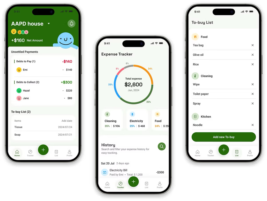
Balance and status, instantly visible. Neutral system reminders replace awkward personal follow-ups.

Add Expense

Define ownership, split method, and participants upfront. Clear accountability before ambiguity can build up.

The Solution

Built for how households actually live.

To-Buy List

Shared planning connected directly to expense logging. No more duplicate purchases or repetitive input.

Tracker

Monthly overview of shared and personal spending by category. Personal budgeting, without the extra effort.

Design System

A visual language built for financial clarity.

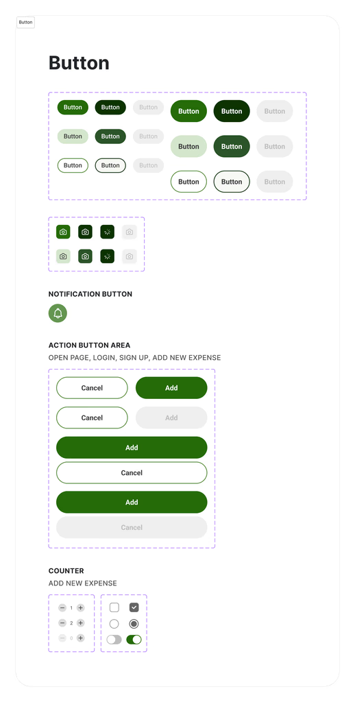
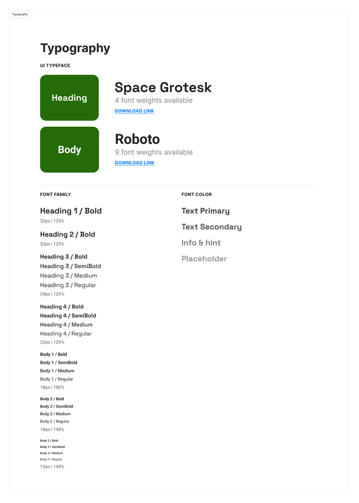
Green signals financial status and action. Typography prioritises legibility for quick scanning. Every component reduces cognitive load.

Make responsibility visible Reduce coordination effort Lower social friction Reframe the emotional experience
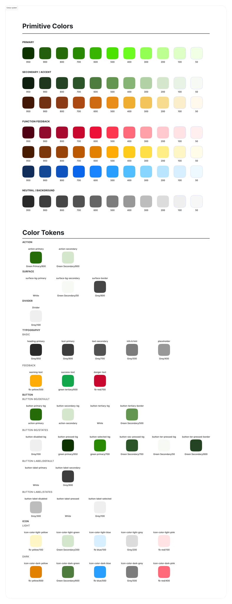
Colour tokens
Button components
Typography
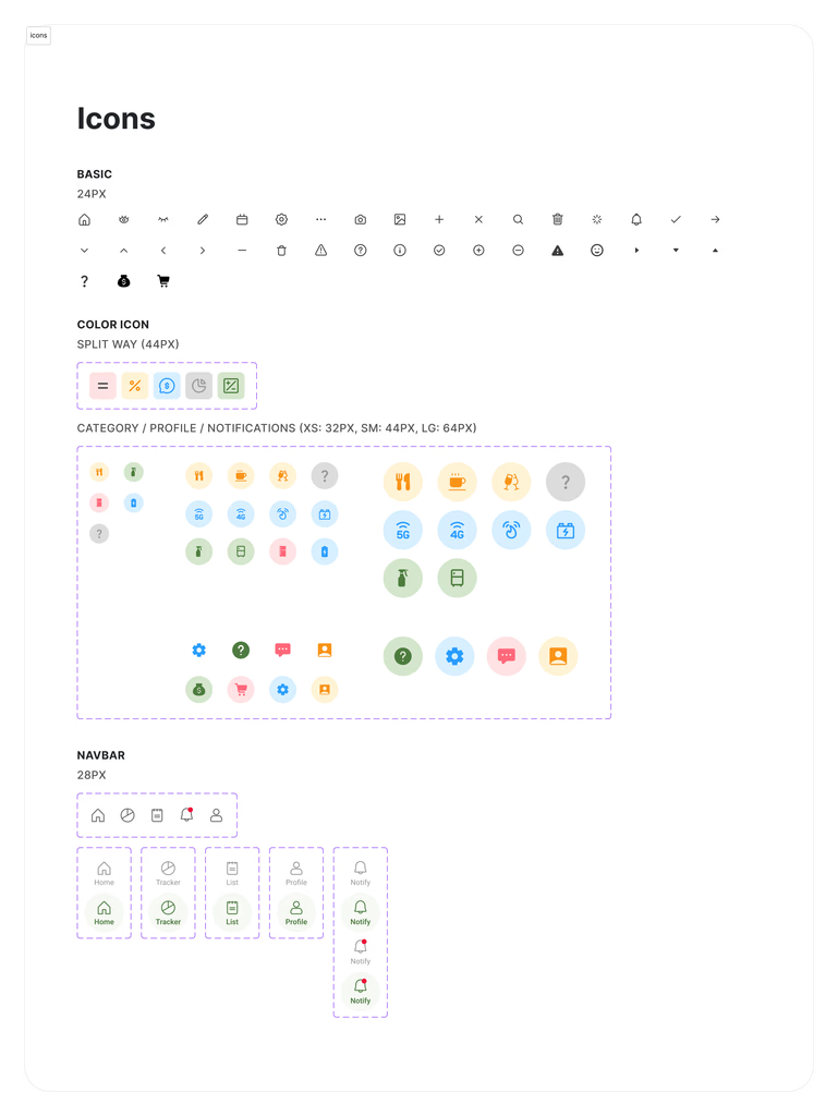
Icons

scroll to explore ↓

How We Got There

From a messy household problem to a clear system.

01

Research → Reframe

9 interviews revealed the pain was coordination, not calculation. We reframed the entire brief: from bill-splitting tool to a shared coordination system.

02

Archetypes → Scope

3 behavioural archetypes mapped across 2 dimensions shaped what to build. The result: 4 focused flows — not a bloated tool trying to do everything.

03

Wireframes → Iteration

A full sprint on information hierarchy before visual polish. 3 rounds of usability testing refined clarity, reduced friction, and validated every flow.

Outcome

Hi-fi prototype across 4 key flows. Delivered in 2 sprints.

Full design system established. Usability-tested across 3 rounds. Ready for handoff — with activation and retention metrics defined.