Case Study · UI/UX Design Intern · 2025

Co-PR

A home screen redesign that turned a data-heavy PR tracker into a personal roadmap.
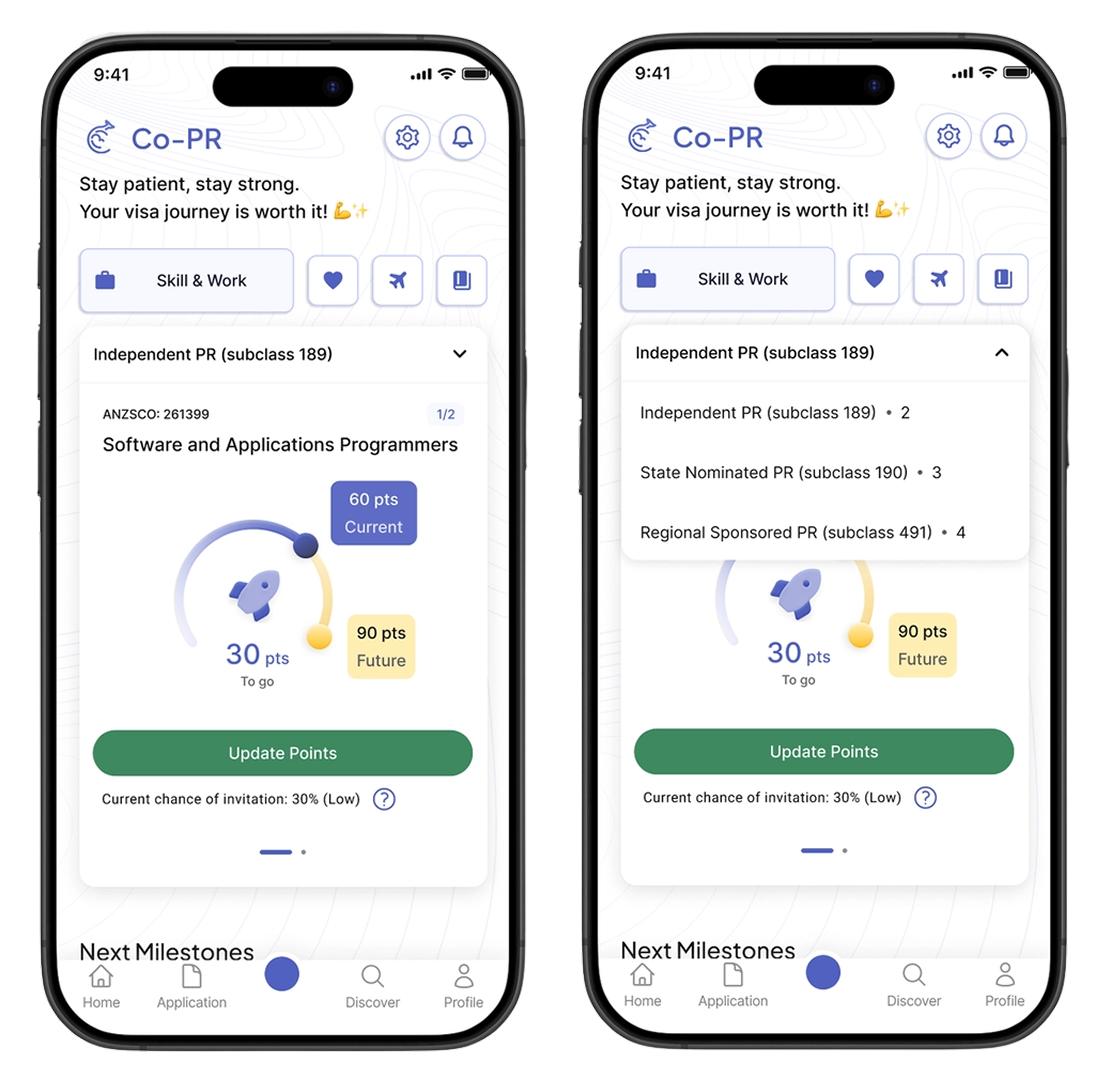
1 Week UI/UX Design Figma
Co-PR app screens
The Research

Users didn't need more information — they needed a clearer place to start.

The existing home surfaced everything at once: multiple PR pathways, points data, and a news feed. Users froze — not from lack of understanding, but from having no obvious starting point.

3
core user pain points: too many options, low guidance, low awareness
5
key design changes shipped in the redesign
1 wk
from brief to final hi-fi prototype
"How do we display all PR pathway data on the home screen?" "How do we show each user only what's most urgent for them right now?"
The Solution

A home screen that knows where you are in the journey.
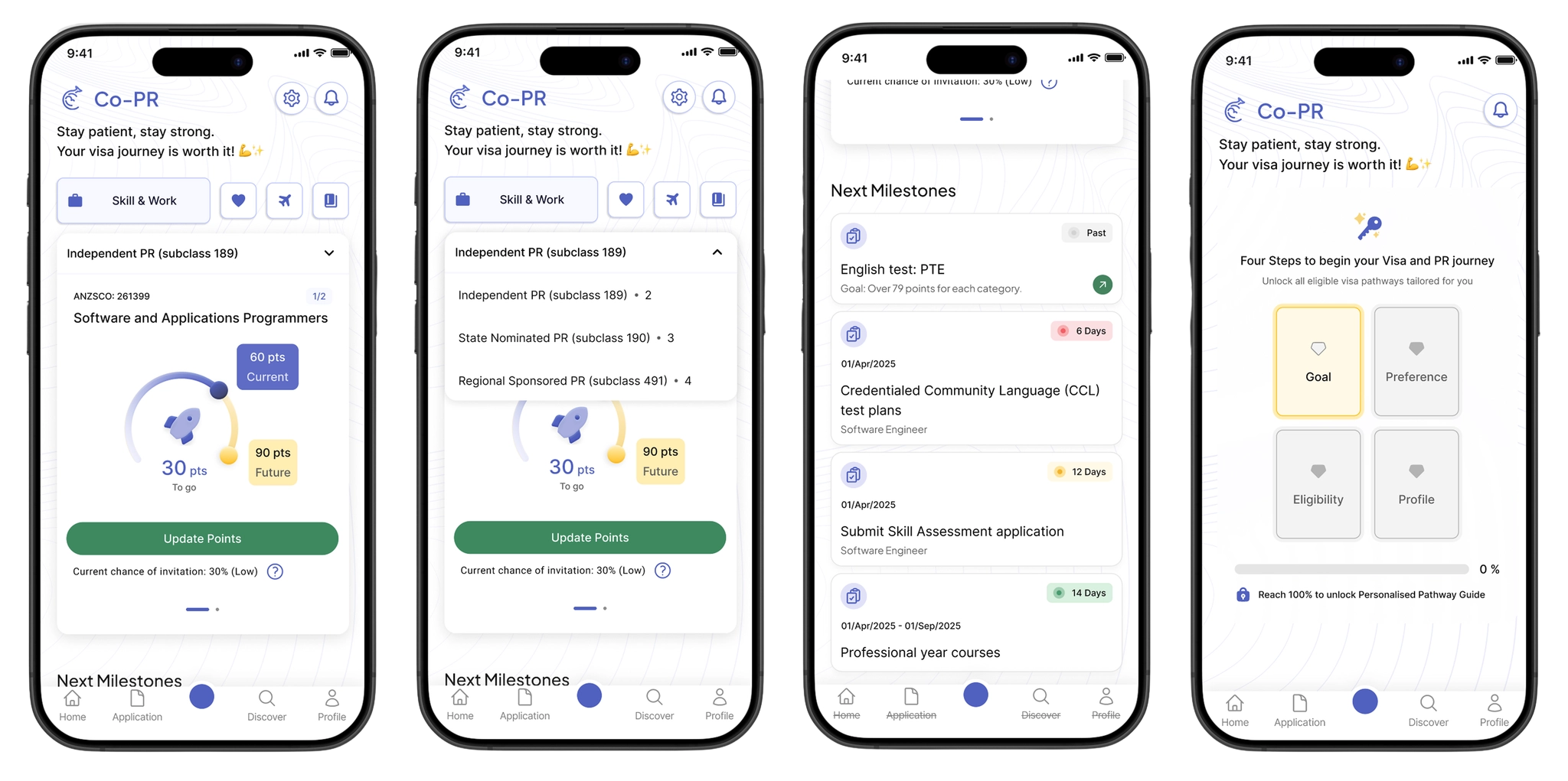
Co-PR redesigned screens

Pathway Dashboard

Pathway selector + score arc + contextual CTAs. See your gap, know your next step.

Guided Onboarding

4-step setup for first-time users that progressively unlocks a personalised pathway guide.

Before & After

From everything at once, to only what matters now.
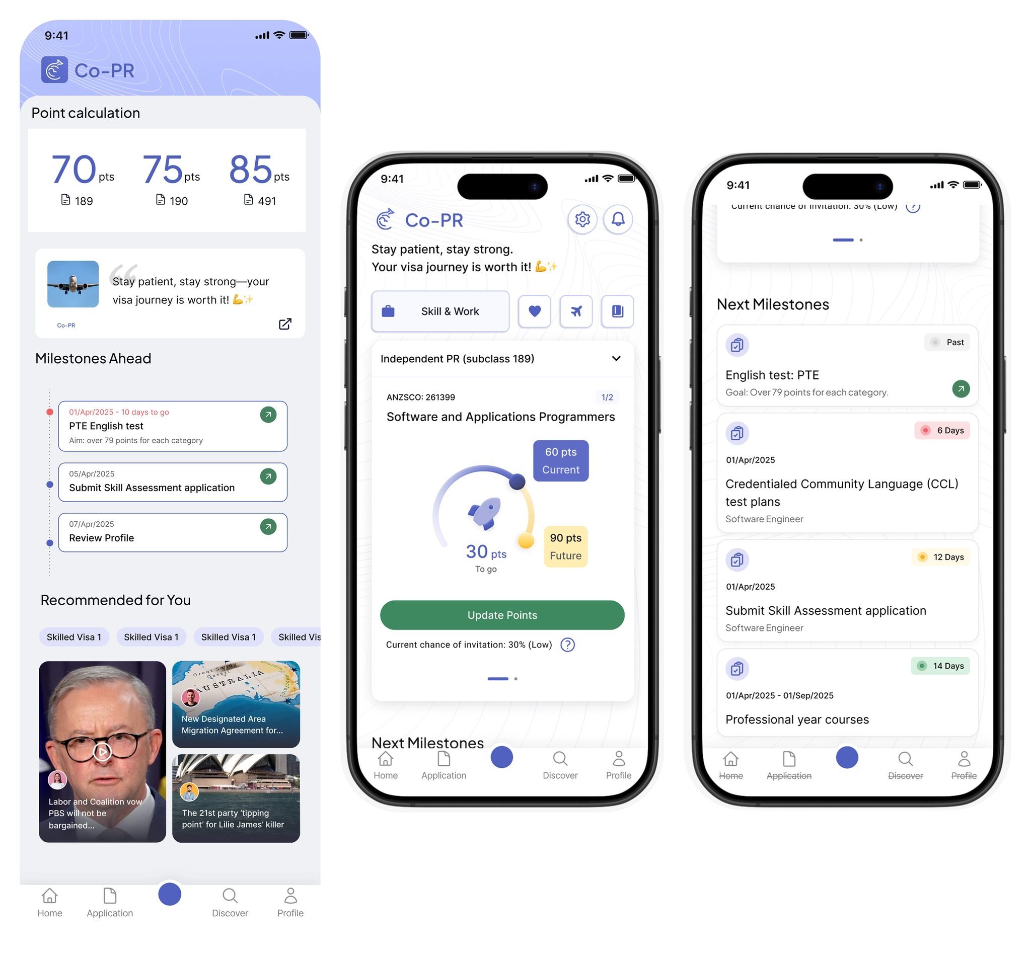
Before and after comparison
News feed on home Moved to Discover tab
Raw points list Score arc + gap visualisation
Multiple pathways shown at once Pathway selector — one focus at a time
No onboarding for new users 4-step guided setup that unlocks progressively
How We Got There

Audit, redesign, validate — in 1 week.

01

Audit → Reframe

The old home tried to be everything. We mapped what users needed on day 1 vs. day 30 and designed for both separately.

02

Redesign → Remove

Built the home around a pathway selector and score arc. Cut the news feed entirely — moved it to the Discover tab.

03

Onboard → Guide

First-time users get a 4-step guided setup. Returning users see only their most urgent next milestone.

Outcome

Users said it finally felt usable.

Validated through user testing after a 1-week design sprint.

+20%
user satisfaction score

Easier to navigate — users had a clear starting point and knew what to do next.

Easier to find what they need — key info surfaced instead of buried under data.

Less intimidating — the lighter UI made the PR process feel approachable, not overwhelming.